June 8, 2026
Safety Leading Indicators Dashboard
A safety leading indicators dashboard helps you spot risk before it turns into injuries, serious incidents, or operational disruption. Instead of waiting for lagging metrics like recordables or lost time rates, you use forward-looking data to see whether your controls, leadership behaviors, and field processes are strong enough to prevent harm. The real value is not in the dashboard alone. It comes from choosing the right indicators, reviewing them at the right level, and using them to trigger action. For organizations focused on serious injury and fatality prevention, this kind of dashboard can become a practical decision tool rather than just another reporting screen.
What a Safety Leading Indicators Dashboard Actually Does
A safety leading indicators dashboard brings together the measures that show whether your safety system is actively reducing exposure. It gives you a live or regularly updated view of the conditions, behaviors, and process signals that tend to show up before incidents occur.
Unlike a dashboard built mostly around lagging indicators, this format is designed to support prevention. It helps you answer questions such as:
- Are critical risks being identified early enough?
- Are leaders spending time on the right safety activities?
- Are corrective actions being closed before exposure grows?
- Are weak signals increasing in one site, team, or task?
- Are your controls improving, holding steady, or drifting?
For many organizations, the biggest shift is moving from retrospective reporting to operational foresight. A strong safety dashboard does not just show what happened. It helps you decide where to intervene next.
Leading vs. Lagging Indicators in a Safety Dashboard
Lagging indicators measure outcomes that have already happened. Common examples include TRIR, LTIR, DART, recordable injuries, and severity rates. These metrics matter because they show results, but they do not tell you enough about whether risk is building right now.
Leading indicators focus on the activities and conditions that influence future outcomes. They are more useful when you want earlier warning and faster prevention. Examples include quality of field observations, overdue corrective actions, leadership engagement in the field, critical control verification, near miss reporting trends, and completion of high-value training tied to real exposure.
The best dashboard uses both, but not in equal proportion. If your view is dominated by lagging data, you stay reactive. If your leading indicators are relevant to high-consequence risk, you gain a clearer picture of whether your system is actually preventing serious harm. For a deeper comparison, see leading vs. lagging indicators.
Core Metrics to Include on a Safety Leading Indicators Dashboard
The right dashboard is not the one with the most data. It is the one with the few indicators that reliably show whether risk is rising or controls are strengthening. In most organizations, a useful dashboard should focus on a small number of high-impact metrics. Starting with a few critical KPIs often creates focus without burying the signal.
Critical Risk Identification and Exposure Trends
One of the most important sections of a safety leading indicators dashboard shows whether high-risk work is being identified consistently. If exposure is not visible, prevention will always be late.
- Number of high-risk tasks identified by site or function
- Frequency of critical risk assessments completed on time
- Repeat exposure patterns by area, shift, or contractor group
- Trend in unmitigated high-potential conditions
These indicators are especially useful in environments where serious injury and fatality potential matters more than simple incident counts.
Near Miss and Weak Signal Reporting
Near miss data is one of the most common components of a leading indicators dashboard, but volume alone can be misleading. A high count can mean strong reporting culture, while a low count can mean either lower exposure or underreporting. That is why quality and pattern analysis matter more than raw totals.
- Near miss reporting rate per team or location
- Percentage of high-potential near misses reviewed within target time
- Repeat near miss categories
- Escalation rate of weak signals tied to critical risks
Corrective Action Closure and Control Effectiveness
Many dashboards show actions closed on time, but the better question is whether the right actions are closing the right exposure. Action data becomes valuable when it is linked to critical controls, recurring hazards, and ownership clarity.
- Corrective actions closed on time
- Overdue actions by risk level
- Average time to close high-priority actions
- Reopened actions or repeat findings after closure
- Verified effectiveness of implemented controls
Leadership Activity Indicators
For organizations that care about culture and operational discipline, leadership indicators deserve a dedicated place on the dashboard. A large number of safety dashboards miss this area, even though leadership behavior often shapes what gets reinforced in the field.
- Field safety conversations completed by leaders
- Quality score of leadership engagements
- Percentage of critical issues escalated by frontline leaders
- Follow-through rate on commitments made during site visits
This is also where a leadership-focused approach aligns well with how Krause Bell Group works: data should support stronger leadership practice, not replace it.
Training and Competency Indicators
Training metrics belong on the dashboard only when they connect to actual exposure and critical task performance. Generic completion rates alone may be less meaningful indicators. Competency signals are stronger when they reflect readiness for high-risk work.
- Completion of critical risk training by role
- Competency validation for high-risk tasks
- Refresher compliance for critical controls
- Training gaps in teams with elevated exposure trends
Inspection, Audit, and Verification Indicators
Inspections and audits become leading indicators when they show whether controls are present and functioning before harm occurs.
- Completion of planned inspections on time
- Critical control verification pass rate
- Repeat findings from audits and inspections
- Open verification failures by site or risk category
What Good Leading Indicators Look Like
Not every proactive metric is a good leading indicator. A useful one should be closely tied to meaningful risk, practical to measure, and able to guide a decision. If the metric looks active but does not change how people prioritize work, it is probably noise.
Strong leading indicators usually have these characteristics:
- They connect to critical risks, not just general safety activity
- They can be influenced by real action
- They are reviewed frequently enough to support intervention
- They are segmented by site, team, task, or exposure type
- They reveal drift, gaps, or recurring patterns early
For example, “number of toolbox talks completed” may look proactive, but experts caution that generic counts may not indicate real risk reduction on their own. “Percentage of high-risk crews with verified pre-task control review before confined space work” is more useful because it is specific, risk-linked, and actionable.
How to Build a Dashboard that Supports Prevention
Most organizations do not need more metrics. They need a better method for selecting the few that matter. The process below keeps the dashboard tied to operational reality rather than generic reporting.
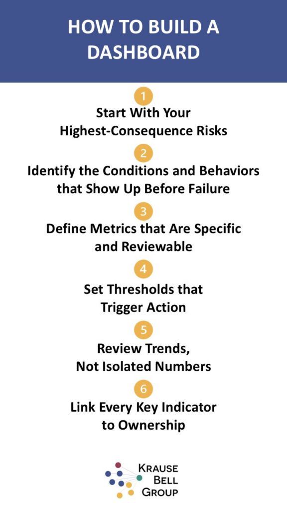
1. Start With Your Highest-Consequence Risks
Begin with the exposures most likely to cause serious injury, fatality, major operational disruption, or significant regulatory impact. This keeps your dashboard grounded in what matters most.
2. Identify the Conditions and Behaviors that Show Up Before Failure
Look at previous incidents, near misses, field observations, and operational reviews. Ask which weak signals tended to appear before controls broke down. That is where leading indicators should come from.
3. Define Metrics that Are Specific and Reviewable
A metric should be simple enough to track consistently and clear enough to support a decision. If people debate what it means every time they see it, the metric is not ready.
4. Set Thresholds that Trigger Action
A dashboard is only useful when people know what action to take. Decide in advance what counts as normal variation, what needs investigation, and what requires immediate intervention.
5. Review Trends, Not Isolated Numbers
A single week of data rarely tells the full story. Look for movement over time, repeat patterns by site, and combinations of indicators that suggest control weakness.
6. Link Every Key Indicator to Ownership
Someone should be accountable for reviewing each metric, understanding the cause, and following through on the response. Without ownership, dashboards quickly become passive reports.
Recommended Dashboard Structure
If you are designing or refining a safety leading indicators dashboard, a practical structure is to group metrics by prevention logic rather than by department. That makes it easier to see whether your system is detecting risk, responding to it, and verifying effectiveness.
| Dashboard Section | What it Shows | Example Indicators |
| Risk exposure | Where critical risk is present or increasing | High-risk task count, exposure trend, unmitigated hazards |
| Signal detection | Whether early warnings are being surfaced | Near miss quality, weak signal reports, repeat categories |
| Control execution | Whether planned controls are being applied | Inspection completion, control verification, permit quality |
| Response and follow-through | How quickly and effectively issues are addressed | Action closure rate, overdue high-risk actions, effectiveness checks |
| Leadership and learning | Whether leaders and teams reinforce prevention | Field engagement quality, coaching actions, competency validation |
Common Mistakes that Make Dashboards Less Useful
Many safety dashboards fail because they look complete but do not support prevention. The most common issues are familiar across industries.
- Tracking too many indicators with no clear priority
- Using activity counts that are easy to collect but weakly tied to risk
- Reviewing the same metrics at every organizational level
- Failing to distinguish serious injury and fatality exposure from minor injury trends
- Showing overdue actions without testing whether actions worked
- Presenting data without thresholds, ownership, or response expectations
- Relying on manual spreadsheets that delay updates and weaken trust in the data
If your dashboard creates discussion but not decisions, it needs simplification and sharper alignment to risk. It can also help to avoid letting the safety scorecard drive the wrong behavior.
How a Safety Dashboard Supports SIF Prevention
Organizations that want to prevent serious injuries and fatalities need more than a general KPI dashboard. They need indicators that reveal exposure to critical risk and the strength of controls around that exposure. This is where a safety leading indicators dashboard becomes especially valuable.
For SIF prevention, focus on measures such as:
- Frequency of critical control verification for high-energy hazards
- High-potential near misses by task type
- Open corrective actions related to life-saving controls
- Leadership review of SIF exposure trends
- Repeat deviations in permit-to-work or isolation processes
This approach fits a broader prevention strategy where data, leadership, culture, and systems work together. A dashboard should make those connections more visible, not reduce safety to a scoreboard. Additional examples of leading indicators for SIF prevention can help sharpen that focus.
Using Dashboard Data to Drive Action
The strongest dashboards are part of a closed loop. Data is collected, patterns are reviewed, decisions are made, actions are assigned, and effectiveness is checked. Without that loop, even well-designed indicators lose value.
A practical review cycle usually looks like this:
- Collect data from observations, inspections, action tracking, training, and risk reviews
- Visualize trends by site, team, task, or critical risk category
- Discuss what changed and why
- Assign actions with deadlines and clear owners
- Verify whether the actions reduced exposure or improved control strength
- Adjust the dashboard if certain metrics no longer predict useful action
That final step matters. A good leading indicators dashboard should evolve as your risk picture and operating environment change.
When You Need Outside Support
Some organizations already have data but struggle to make it meaningful. Others have a dashboard in place, yet the indicators do not reflect leadership behaviors, cultural signals, or serious risk exposure. In those cases, external guidance can help you define the right metrics, connect them to prevention strategy, and improve how leaders use the information.
For companies looking to strengthen safety performance through leadership development, culture alignment, and risk-focused strategy, dashboard design should be part of a wider operating model. That is often where advisory support adds the most value: not by selling a generic tool, but by helping you decide what the dashboard should measure and how it should drive better safety decisions. For a more specific model, review an executive safety dashboard approach.
FAQs About Safety Leading Indicators Dashboards
* Developed with the support of AI and reviewed by Krause Bell Group Editorial Team