July 17, 2025
Detecting the Signal Inside the Noise of Safety Statistics
Executive Summary
Safety statistics provide valuable insight into safety, systems, processes, tools, and operations, but leveraging them can be challenging:
- What is real versus signal noise?
- How to derive actionable meaning and insight.
Applying five key principles can help any leader harness the power of statistics to achieve significant improvements in safety and organizational functioning.
Making Sense of Safety Statistics
Mark Twain once said, “There are three kinds of lies: lies, damned lies, and statistics.” We’re awash in an ocean of safety statistics and yet are still searching for a way to determine what matters and what can be ignored, and predict what might happen next. Our challenge is two-fold: first we need to understand the data in front of us – what’s a real signal versus noise and secondly, we need to be able to ask critical questions of the statistics to derive meaning and insight.
Overcoming these challenges enables leaders to answer important questions such as:
- What controls do we have to eliminate SIF incidents and are they working?
- Is our trend in incidents “real” or just random variation?
- How do we know if our programs and initiatives are working to improve safety?
- Is the recent increase in near misses reporting a good thing?
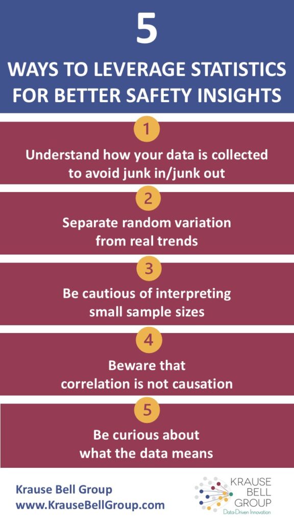
Five Principles to Leverage Statistics for Better Safety Insights
To help you answer these questions and find the signal within the haystack of noise, below are five principles to employ. Applied consistently, these will help you better discern your data and help you make more impactful decisions to protect life on the shop floor.
- Understand how your data is collected to avoid junk in/junk out.
It isn’t easy, but you need to have a clear understanding of how data is collected in your systems and turned into charts and reports. We once worked with a client who found that a large percentage of their incidents occurred at 6am on Mondays. This led them to double down on their pre-job risk assessments and hazard inspections until it was discovered that when the entry in the incident report was left blank, the time and day automatically defaulted to, you guessed it, 6am on Monday. Roll up your sleeves and get into the data fields in your incident management system. Learn what the defaults are, how data is entered and by whom, and what fields are typically neglected and why. - Separate random variation from real trends.
We often see clients with monthly incident data reported on multi-year long graphs. As you would expect, the incident frequencies vary from month to month. When we talk to the site about this variation, they point to a couple of months when the incidents spike and they discuss what happened on the site and then what changes they made, proudly pointing to a few other months where the incidents decreased. The problem is that all this data could be noise, simple random variation that has nothing to do with what was happening at the time and what programs were put in place. As humans, we’re constantly looking for patterns and a narrative that explains variation, even if we’re chasing ghosts. So how do we know what is random variation and what is a real and significant trend? The answer is a statistical process control chart (SPC). This is a simple method for putting statistical controls around the variation so leaders can easily see what’s a real trend and what’s noise. - Be cautious of interpreting small sample sizes.
Look closely at denominators. Do you find that your smaller sites sometimes have both the highest and lowest incident rates? The smaller the number of people in a particular site, the more likely their scores on anything (engagement surveys, injury rates, compliance, etc.) will be either near the top or near the bottom. The reason is that for smaller sites, it takes fewer people to significantly impact the average, especially when there are fewer than 30 people at that site. The good news is that if you’re trying to have a positive impact on the site’s culture, it may not take much to move the needle significantly. On the other hand, it also means that it doesn’t take much (e.g., one poor leader) to negatively impact the culture. - Beware that correlation is not causation.
Do you know there is a strong correlation between the number of bars and the number of churches in American towns? Does that mean that when there are a lot of bars, there are more sinners which creates a need for more churches? Or do more people go to church and get absolved of their sins and therefore are “freer” to hit the bars? Note: this is our need for a narrative coming back.When two things are related to each other (in statistics we call them correlated), it means that they tend to occur together – for example, when one goes up, the other tends to go up as well. However, this doesn’t mean one CAUSES the other to go up. It could just be a random correlation (statisticians call it “spurious” to sound smart) such as the correlation between the divorce rate in Maine and the consumption of margarine (no really, they’re correlated). The correlation could also have a third factor causing both to increase, such as in our earlier example in which population growth drives both the number of bars and the number of churches. When you’re weighing the impact of a program or initiative, you need to keep this in mind so you don’t make inaccurate assumptions about the effectiveness of a program. - Be curious about what the data means.
To do this, we need to ask questions and be willing to dig deeper. For example, if someone tells you that you’ve had an upward trend in the reporting of near misses across the organization over the past four months, what does that mean to you? Well, it depends. Are you an organization who has traditionally discouraged reporting of anything, especially near misses, and have low safety maturity? If that’s the case, then an upward trend in near miss reporting could be a good thing. It could mean that your efforts to improve the culture are beginning to take root and cause employees to feel more trust that if they report issues, they will be addressed. AND this increase in near-miss reporting could also mean that there is truly an increase in exposure and you need to look more closely at what’s happening. At a minimum, you know more than you did before about the exposure levels in the work area and can now do something about it. This may also lead you to wonder how we can regularly understand where each of our sites are in terms of safety maturity. What does it mean to have high safety maturity and how do we get there? Where are we now? Being curious usually leaves you with more questions than answers but is also the beginning of true insight.
Conclusion
Doing the work to glean meaning from the vast amounts of safety data takes effort but is well worth it. We’ve seen time and again how curious leaders have questioned the data and looked deeper into what’s happening on the ground floor, resulting in insight into safety, systems, processes, tools, and operations. When this happens, the opportunity to unlock significant improvements in safety AND organizational functioning are immense.
For more information about turning data and information into an effective dashboard, read What Every Executive Should Look for in a Safety Dashboard